30 Fresh Logos To Get Your Creative Juices Flowing

A hand-picked collection of 30 fresh logo designs that have recently made their way from the drawing board and into the design world.
I’m constantly keeping my eyes open for fresh new logo designs to make their way to the web. Fortunately, there is an awesome community of logo designers out there that steadily crank out new material whether it be for client work or for their own creative fun. This particular showcase isn’t necessarily centered around a particular theme. Some of the work is simple and clever, others are focused more on color and a few are all about the details.
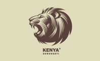
Nature Protection Organization

Super Jeans

Rain
digiMucit

Silverstone

Charleston Naturally

Boxer Show

Full Control Motion Pictures

Beatlove

Plain Paper

Calm Coffee

Swiss

Wineforest

Sweet Land

Word Refuge

Silo

Aedilys

Centro Books

Magic Coffee

Banana

Fusion

WyldLyfe

Gajba Bar Logo

rain bows

Mr. Couch
Svetlitsa

Trava

Showcatcher

Coffee

Waterfall

What are your favorites?
When putting a showcase of logos together, there are always a few that really stand out. In this particular roundup, Nature Protection Organization, Rain, Silverstone and Waterfall are among the few that struck a chord with me. In all honesty, I love them all. Do you have a favorite one or three that stood our in your eyes. Please share your thoughts below. Thanks!


12 Comments
+Add your commentGreat collection! I love Waterfall.
That was the first one I came across when rounding these up. It gave a good vibe for how this post was going to turn out.
some of these are fantastic, but others… realistically wouldn’t translate well at all into black and white, or scaling it down, or even for brand legibility.
Agreed. In most cases a strong logo will scale up and down without losing its appeal and should also be just as recognizable in black and white. Thanks for commenting Elle!
Super Jeans is brilliant. Waterfall is beautiful and simple. I also loved the graphic used in Silverstone, very creative. Wonderful collection!
I had to stare at Super Jeans for a minute to pay tribute to how awesome of an idea it was. It took a clever mind to think that one up. Thanks Ericka!
I love the Waterfall logo. Something to me just really stands out about it. It’s modern, but I can still see the element of it being a waterfall. Great post, thanks. :)
One of my favorite from the list, hands down. You should check out some more of Michael’s work - http://bit.ly/dnhnzQ I’m glad you enjoyed the post Hillary!
The first one with the lion is very well drawn. I love how simple, yet strong it is. Great roundup!
A very well-executed mark, no doubt. I appreciate the feedback Hugh.
Those are some really nice logos and I especially like the rain one.
great work right there.